


Who was Francesco Griffo?
By James Clough
2016


Typefaces like Times New Roman or Garamond, which are familiar to our eyes from what we read in books and on computer screens, both have their origins in a book printed by Aldus Manutius in Venice at the end of the fifteenth century. The letterforms of those and many other similar typefaces represent the only artistic product of the Italian Renaissance which has remained virtually unaltered up to our times.
The process of making movable type began with bars of steel upon which letters were cut in relief in order to make punches. This is the very heart of printing and a good ‘punchcutter’ had a thorough understanding of letterforms and worked with great precision. Aldus was fortunate to have an exceptionally talented craftsman to make his type who was known by the name of Francesco da Bologna, but whose real name, Francesco Griffo, was only discovered in 1883.
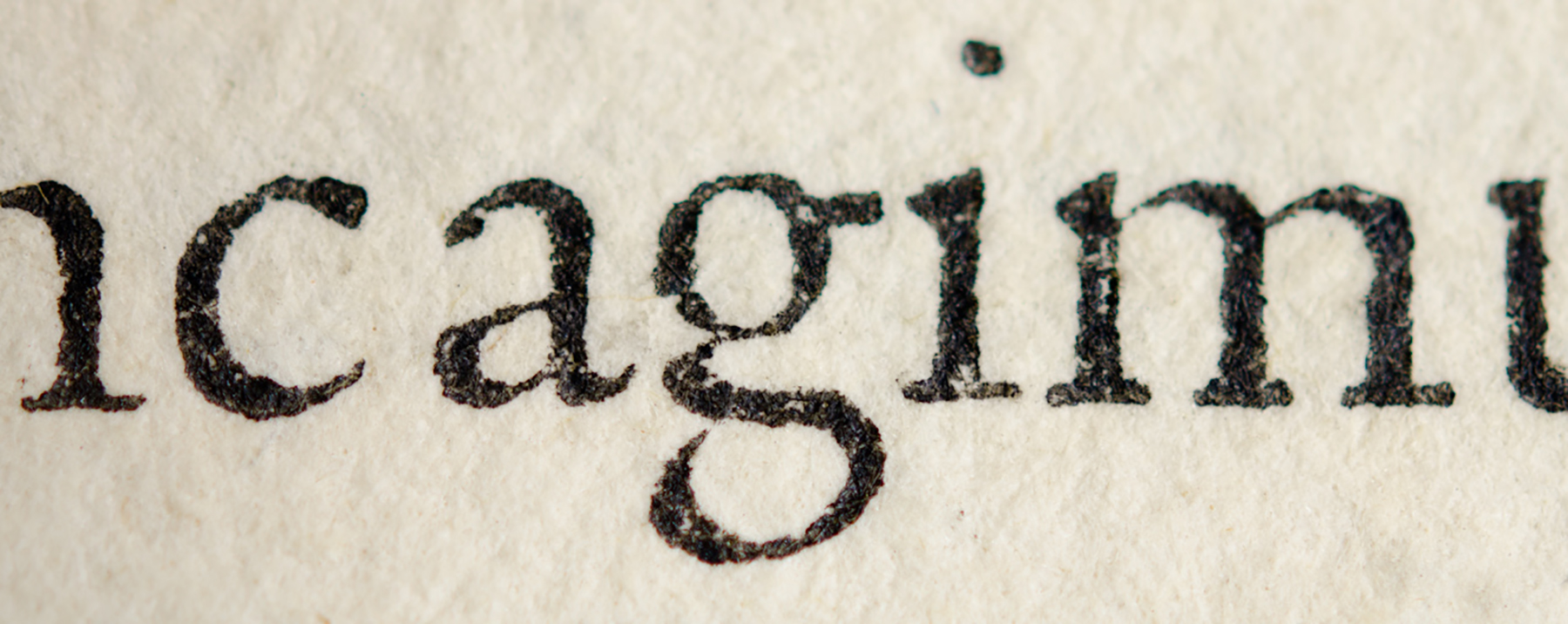
Among the various typefaces cut by Griffo for Aldus, one that appears for the first time in the De Aetna of 1496 turned out to be the most significant roman type in the entire history of printing.
Steel punches for making type
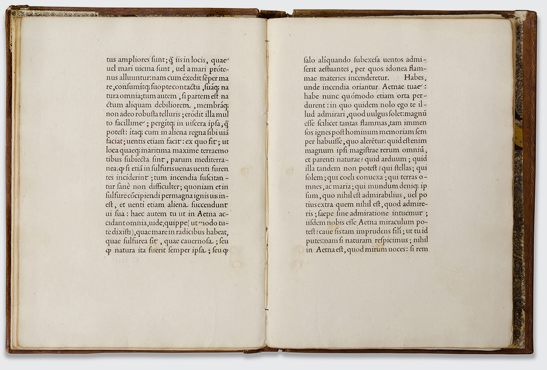
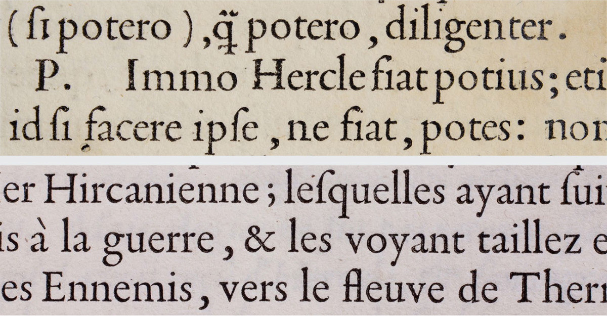
Double page from De Aetna, printed by Aldus Manutius, Venice 1496. Biblioteca Palatina Parma.
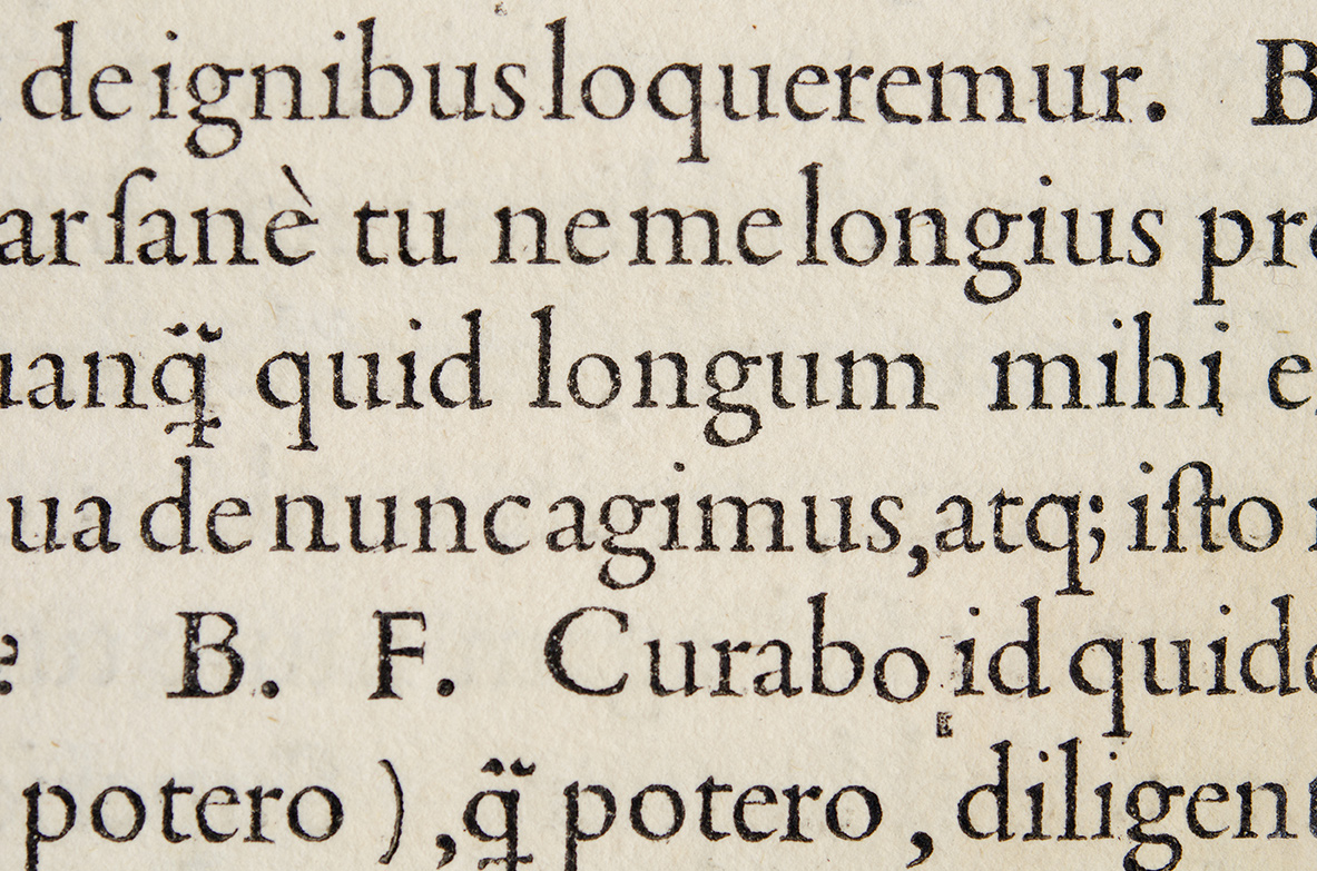
Detail of Griffo’s De Aetna roman. Biblioteca Palatina Parma.
Even though that typeface had been preceded by a celebrated roman first printed in Venice in 1470 by the Frenchman Nicolas Jenson for his his Eusebius, the new proportions and design details of the De Aetna roman became the model for the following centuries. Unlike Jenson’s roman, which was immediately acclaimed and copied, more than thirty years were to pass before the innovations of Griffo’s De Aetna roman were to be fully appreciated.
From about 1530 Venice lost its position to Paris as leader in the typographic arts. In this city a new and refined style of typography emerged that was based on Venetian romans and especially on the De Aetna roman. Right up until the end of the century all French punchcutters, including the famous Claude Garamond, copied Francesco da Bologna’s De Aetna roman. Firmin Didot in a note in his Virgil, published in Paris in 1806, was the first to make this observation.
‘Garamond […] just copied Francesco da Bologna’s type at different sizes; and it was he who got all the honour […].
Griffo’s De Aetna roman (above) compared with one of Garamond’s romans.
Griffo’s collaboration with Aldus came to an end when the Venetian Senate accepted Aldus’ request for exclusive rights to the first italic type, cut by Griffo for the highly successful series of pocket classics. Aldus praises his punchcutter in his Virgil of 1501, the first book of the series set in italics. However, very soon after this the italic was copied and used by other printers beyond the confines of the Venetian Republic and after a few decades it was also copied by Garamond.
There must have been a disagreement between Griffo and Aldus concerning ownership of the italic types. In fact, two years later, in 1503, the distinguished Jewish printer Gershom Soncino published a Petrarch in Fano which was set in another italic cut by Griffo. In the dedication to Cesare Sforza, Soncino mentions ‘[…] the most illustrious sculptor of Latin, Greek and Hebrew letters called Francesco da Bologna’ and also testifies that he cut all of Aldus’ types.
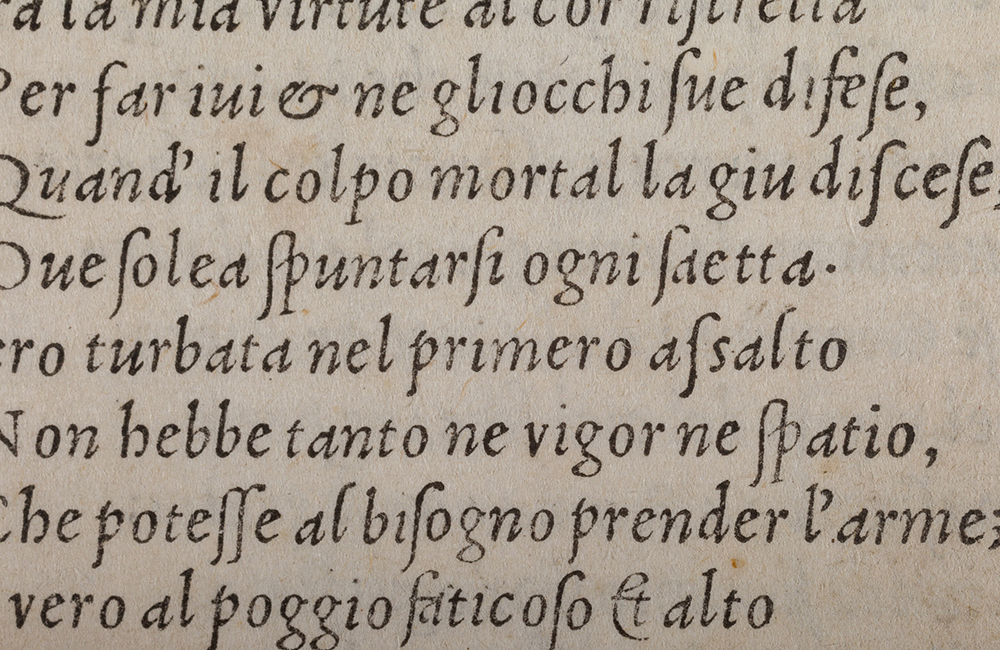
Detail of Griffo’s second italic from the Petrarca printed by Gershom Soncino, Fano 1503. Opere volgari di Messer Francesco Petrarca, Gershom Soncino, Fano 1503. Biblioteca Comunale Federiciana di Fano. Foto di Alex Cavuoto e Vanja Macovaz.
This collaboration with Soncino, a roman cut for Ottaviano Petrucci and several other italics cut for various printers in central Italy represent all that we know of Griffo’s activities until 1516 when he returned to Bologna.
In his home town Griffo accomplished what may have been a long-cherished ambition to become a printer. He cut a very small italic (about 6 points) and used it to print six editions in the smallest of formats. His first book was a Petrarch and in it there is the third printed testimony concerning himself, written in his own words as printer and publisher. Griffo mentions the Greek and Latin types he cut for Aldus and proclaims the new italic type to his readers.
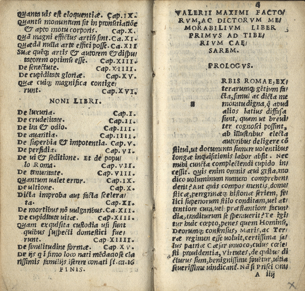
Griffo’s third italic printed by himself. Double page from Valerio Massimo, Bologna 1516. Biblioteca dell’Archiginnasio Bologna.
Final information on his life comes from a document discovered in the Bologna Archivio di Stato in 1899. It concerns a violent quarrel that took place in May 1518 between Griffo and his son-in-law that ended with the latter’s death after being struck on the head with a steel bar. No document has survived to tell us of the sentence that Griffo received in the consequential trial, but as the penalty for murder in Bologna at that time was death, it is presumable that his life ended accordingly.
Be that as it may, his high-ranking status in the history of typography is now very widely acknowledged. But research on his life and his work continues, and to quote from Giovanni Mardersteig, with regards to Francesco da Bologna ‘the last word has not yet been said.’
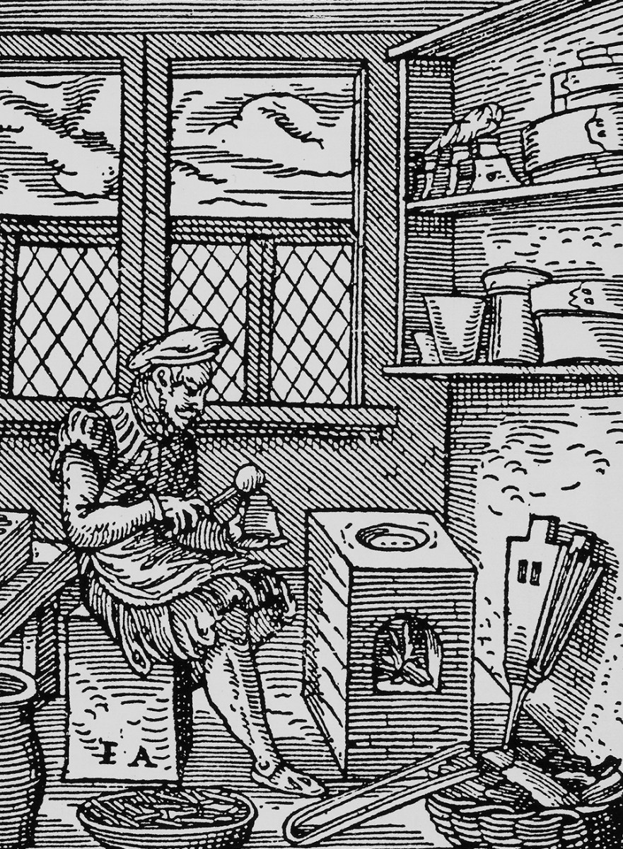
Woodcut showing a typefounder pouring molten type metal into a hand mould. Jost Amman, Standbuch, Frankfurt am Main 1568.
