Ancient, modern, ancient
By Mauro Zennaro
2016


The Roman capital letters were a graphic standard for centuries. They were widespread throughout the Empire and they were always made in the same way. They were a real ‘corporate identity’ for the city of Rome and the real structure of Roman power was summed up in the four letters of the acronym SPQR. The Roman capitals that we know so well in their epigraphic form, were a bilinear and therefore ‘majuscule’ writing system. However, there were also cursive and private versions, less regular, which over the centuries contributed to the development of small letters that were simply capital letters deformed by fast writing and that eventually became a distinct writing system.
In the Middle Ages and with the emergence of graphic particularism, there was no longer any graphic homogeneity; this led to the development of local styles of writing styles everywhere, which today might not show any resemblance to the Roman writing, at least in the eyes of non-experts.
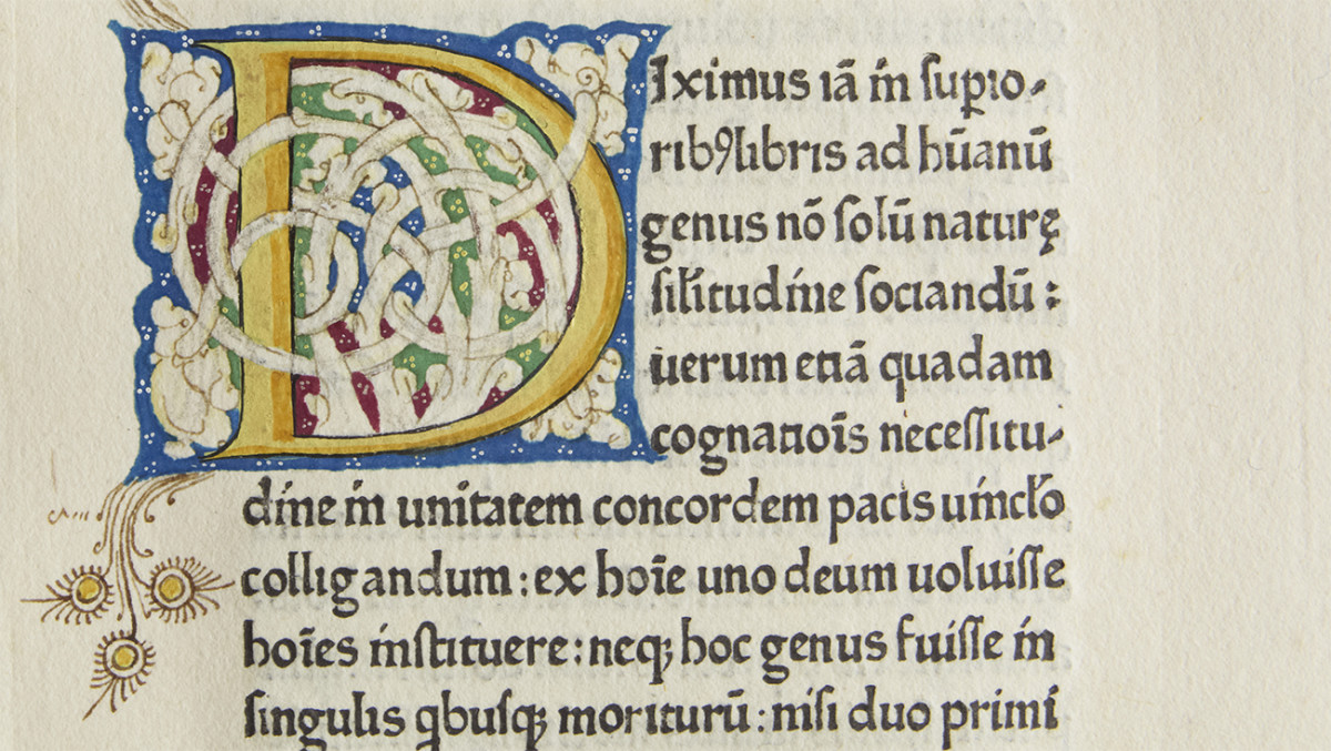
With the Carolingian Holy Roman Empire and the restoration of a central power, Roman capitals returned to favour: an artificial revival, desired by Charlemagne and by his ‘graphic designer’, the British monk Alcuin of York, in order to give a solemn, ancient and classical semblance to the Empire. During that period written Roman capitals were used for books, together with the uncial script and the new script in small letters that we call Carolingian. In the ninth century only the inscribed lapidary examples of the Roman capitals from ancient ruins were known. The original red colour of the letters on the old monuments had been produced with natural pigments and had faded, and thus the predominant colour of Roman civilization was perceived as white. In contrast with many local medieval scripts, it was probably for this reason that the new Carolingian, was light, with generous interlinear spacing: the page was supposed to be as white as possible.
The Carolingian script became widespread throughout the Empire and, naturally enough, it acquired slightly different characteristics, according to the scriptoria where it was produced.
However, until the invention of printing, writing never stopped evolving and changing, especially in the absence of a communication network between town centres and suburban areas, as in the Middle Ages. Those who write letterforms by hand based on a model and, after learning them, continuously repeat them, are sure to develop a personal style of handwriting; in other words the copyists developed their own personal style, keeping the original structure but slightly changing letterforms with personal features. When a schoolmaster teaches writing he provides his own handwriting as an example to his students (in past centuries both were nearly always male), which the latter will adopt turning out their own slightly different styles, and so on.
When universities were established and became widespread in Europe, in the eleventh century, there was a sudden and growing demand for books, which the production technology (the pen) could hardly meet. The stationarii, the university publishers whom the Academic Senate commissioned for the production and sale of books, had to satisfy a growing demand in a short time, and this would have required an industrial production system. In this period faster and more precise writing techniques were needed, but movable type was, unfortunately, not yet available.
Nonetheless, books could no longer be made with the old monastic system, where one or a few copyists wrote the whole text in a long drawn out and precise work following the style of writing used in a specific monastery and during a specific period of time. Though it was slow, such a practice had some advantages: the person who wrote the text (usually a man) had an overall view of the work that he was copying; he was also aware of his work and had the chance to learn something new. But such needs, that were obvious within a monastery, where prayer and study of the Scriptures were of the utmost importance, did not coincide with the ‘industrial’ requirements of the modern world, with university book production that had to meet the demand of large numbers of students. For this reason, the stationarii invented a graphic production method based on a sort of ‘assembly line’ system, which consisted of fragmenting the book into separate sections, called peciae, or ‘pieces’, i.e. parchment rectangles from the single skin of the animal, folded into four parts. Each pecia was assigned to a different scribe and could be sold separately and was very often rented too. In this way a group of scribes could write a book in a short period of time and students could rent any pecia and copy it at their convenience. So students often produced their own books by themselves, copying them from the originals.
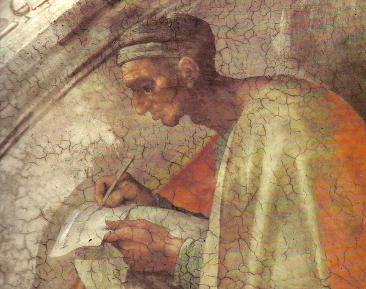
Detail of a scribe from a fresco in the Sistine chapel.
The copying work, that was no longer performed in a monastery, was hard and badly paid; it was not interesting work either because copiers never had an overall view of the book they were working on. It was no coincidence that many students (fairly poor in the past) worked part-time in publishing workshops. It is significant that for the first time, with exceptions of a few female cloisters, even women were allowed to write, though pay was low and there was no chance for cultural advancement. So women, who had always been excluded from culture and studying, were employed in cultural jobs but only as executors. It was in this period that the Carolingian minuscule changed radically.
As we have seen, there are endless kinds of writing and that is inevitable: each of us has learned to write according to a certain model, which on average derives from the so-called English ‘copperplate script’, and each of us has adopted a personal style of handwriting, albeit without moving too far from the model. But despite all the different changes, with printing precisely the same model could be followed and adapted to a personal style. Contrariwise, prior to Gutenberg, the teacher directly taught the student his own writing style. So it was natural that after some time, and with no central monitoring, as was the case in Roman times, new writing models developed with little resemblance to the original model. This procedure, which we could define as extreme characterization, is called canonization.
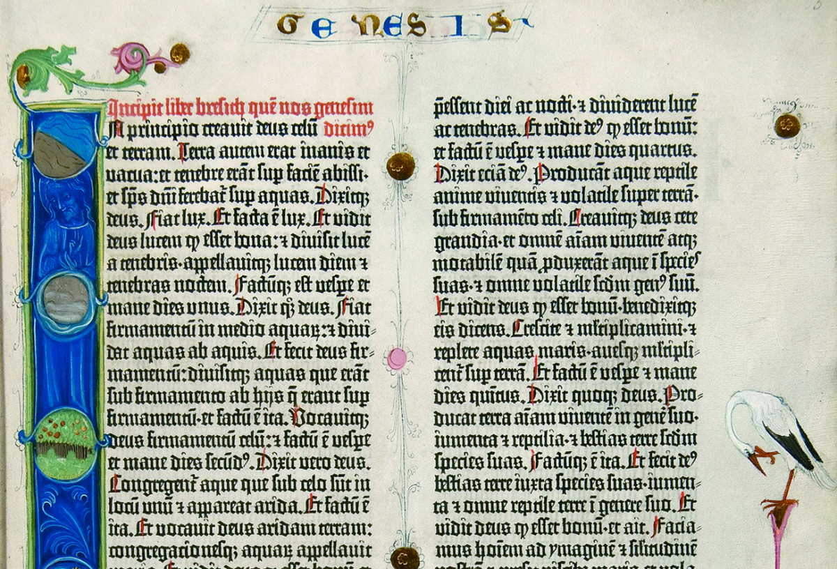
There are examples of different versions of Carolingian: each scriptorium had its own style. But it was when universities were established and became widespread that a deformed version of the Carolingian developed, which was completely different from that of Alcuin and of the scribes of his time. It was no coincidence that such a version was defined littera moderna, or, according to a disparaging definition of the humanists, gotica. First of all, the gotica had nothing to do with the Goths, who moved into central-southern Europe around the end of the Roman Empire. The word ‘gothic’, as is widely known, became a synonym for ‘barbaric’ and for this reason intellectuals from the fourteenth century on thus defined the littera moderna, which in their eyes was unworthy of expressing the graphic forms of the great ancient classics. But let us proceed by order.
The Carolingian minuscule, that was prevailing as a book hand, was adapted to write university texts which conformed to a precise model. The page usually consisted of four columns, in the two central ones there was the classical text; the two lateral ones, in the shape of square brackets, surrounded the central columns with the comments of the professor, which constituted the actual lesson. From a graphical point of view it is interesting that the comment was placed as close as possible to the text it referred to, visually close and therefore directly connectable to it. In order to do this, great design skills were needed but most of all the copies of the university text, examined and approved by the university, had to be identical not only in the text, so without any mistakes, but also in the layout, so as to preserve the perfect correspondence between original text and commentary. More than painstaking work, it was precision mechanics.
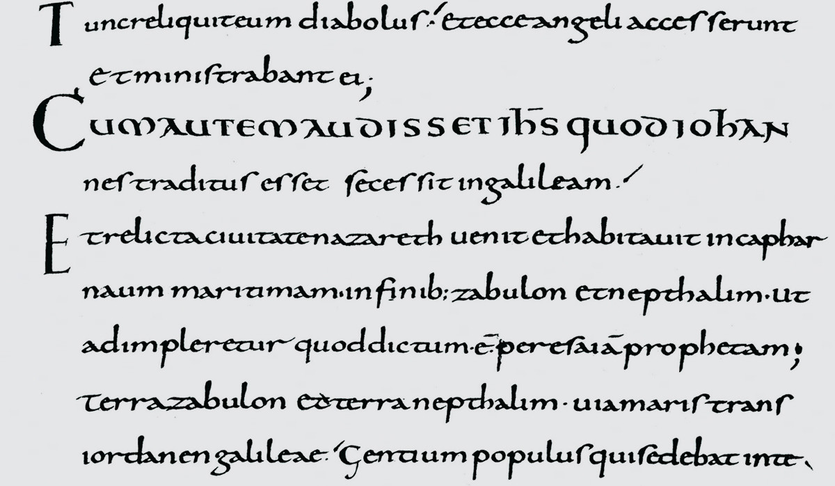
A refined example of Carolingian script from a New Testament, Tours, ninth century.
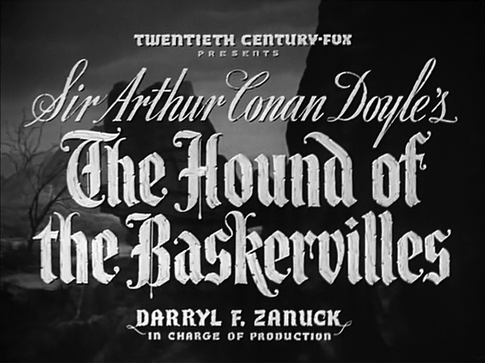
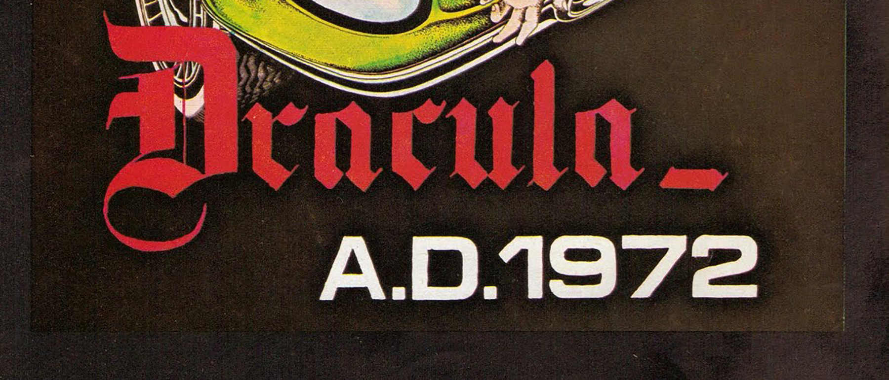
I do not think that the Gothic type (Blackletter in English) was designed for this purpose. However, the need to standardise the letterforms of different people contributed to the transformation of the Carolingian into a broken and rigid kind of writing, made up of identical stokes, with uniform spaces but with little line-spacing: what mattered most was production in series, and consequently the need to save parchment or paper. The littera moderna had turned into a working tool and not only a criterion. The Gothic type (Blackletter) consists of many identical ‘building blocks’ – like Lego. The Gothic type remained not only in the universities but also became widespread throughout Europe as the writing style of well-educated people, leading to narrower, more rigid and more broken versions in northern countries where, appropriately enough, it was called Fraktur. In the south there were rounded versions, especially in Italy, where it was defined rotunda (which might lead to countless stereotypes…). Some styles of Blackletter, written faster and with longer ascenders and descenders, were used as models for professional and bureaucratic writing. The three coeval copies of the Divine Comedy, the original of which was lost, were written in this way, just as Dante wrote his first copy.
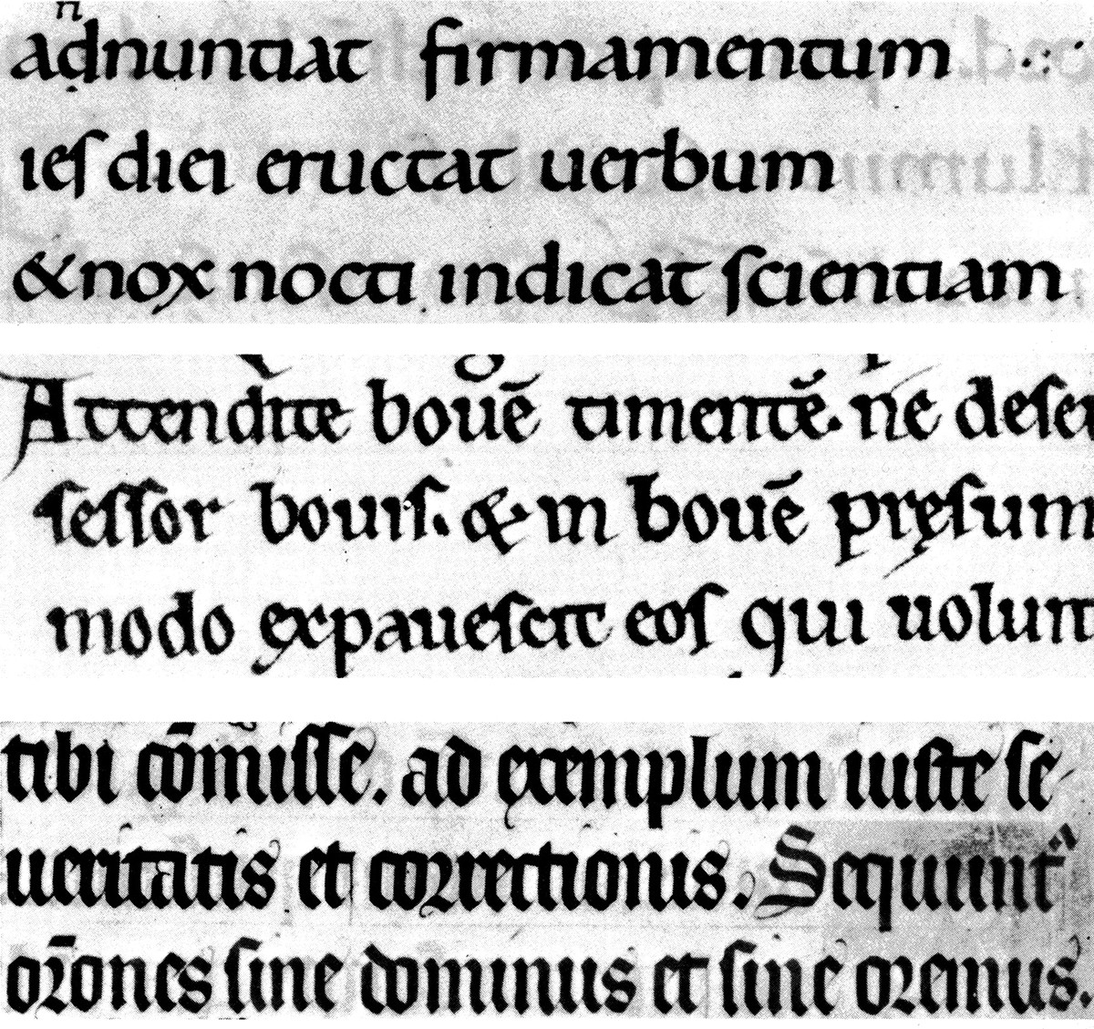
The slow transition from Carolingian to Gothic script. From above: X century, XII century, XIV century.
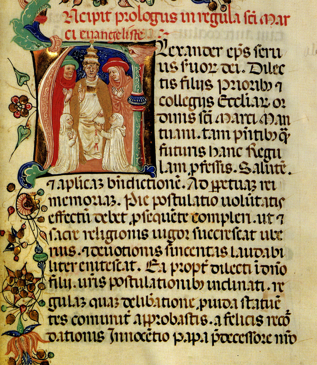
Manuscript in round gothic, written in Italy before 1450.
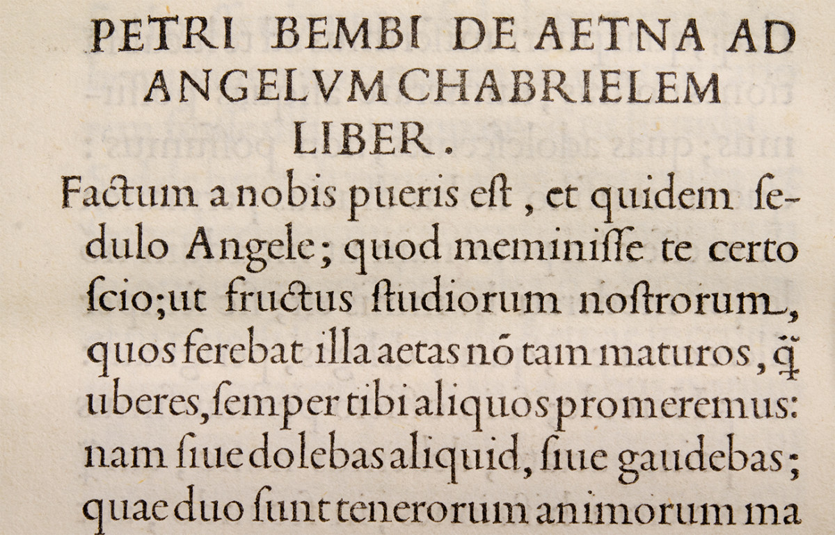
In Italy, starting with Petrarch and the humanists that followed him, the Gothic script lost its status of writing for well-educated people. Like Charlemagne and Alcuin before him, Petrarch considered the whiteness of the Roman ruins as the symbol of classicism. Furthermore, in the absence of any scientific dating criteria and of any real paleographic science, the humanists thought that the Carolingian books were ancient Roman texts – with all that this entails. In the pages of Carolingian script there were beautiful titles in capitals and entire columns in uncial script, and thus it is easily understood why the humanists attributed them to Roman antiquity. The love for classicism led humanists to discover modern philology, necessary to interpret all the different medieval copies, that were full of mistakes. Our knowledge of classical Latin was made possible by them. The intellectuals before Gutenberg also had to be calligraphers and due to high costs they had to write books by themselves. Petrarch set to work to ‘lighten’ the Gothic script; his followers – Poggio Bracciolini and Coluccio Salutati were among the most important – wrote beautiful versions of the Carolingian, more modern and more suitable for combination with the Roman capital letters, light and elegant, perfect to write Cicero, Quintilian, Ovid and all the others. The ‘new’ writing style was aptly called littera antiqua, even though it was entirely suitable for the modern Renaissance book. Then came Gutenberg; he was German and he cut his punches in ‘modern’ letterforms, in other words Gothic forms. The antiqua script had not crossed the Alps at that time.
A page from Gutenberg’s Bible printed in about 1454 in gothic Textura type.
Then Sweynheym and Pannartz brought printing to Italy and adapted their types to our Italian tastes (with some rigidity at the beginning…). And finally the great Italian typography got underway – with Francesco Griffo as its prime representative.
Sweynheym & Pannartz, Subiaco, 1465.
De Aetna. Aldus Manutius, Venice, 1496, with type cut by Griffo.
However, the Gothic script was still extremely popular. In some areas such as law and theology, Italian books continued to be published in gothic types for a long time, some even up to the seventeenth century. And in northern countries, where the Gothic script continued to be the common writing style, especially to express the graphic and cultural distances between Protestantism and Catholicism, the ‘Roman’ style of type became widespread only recently. In Germany Adolf Hitler abolished the Gothic script in 1941, when he realized that in the occupied countries nobody was able to read his insane speeches and, in order to get out of the awkward situation, he declared that he had discovered that the supposedly Germanic writing was, as a matter of fact, of Jewish origin.
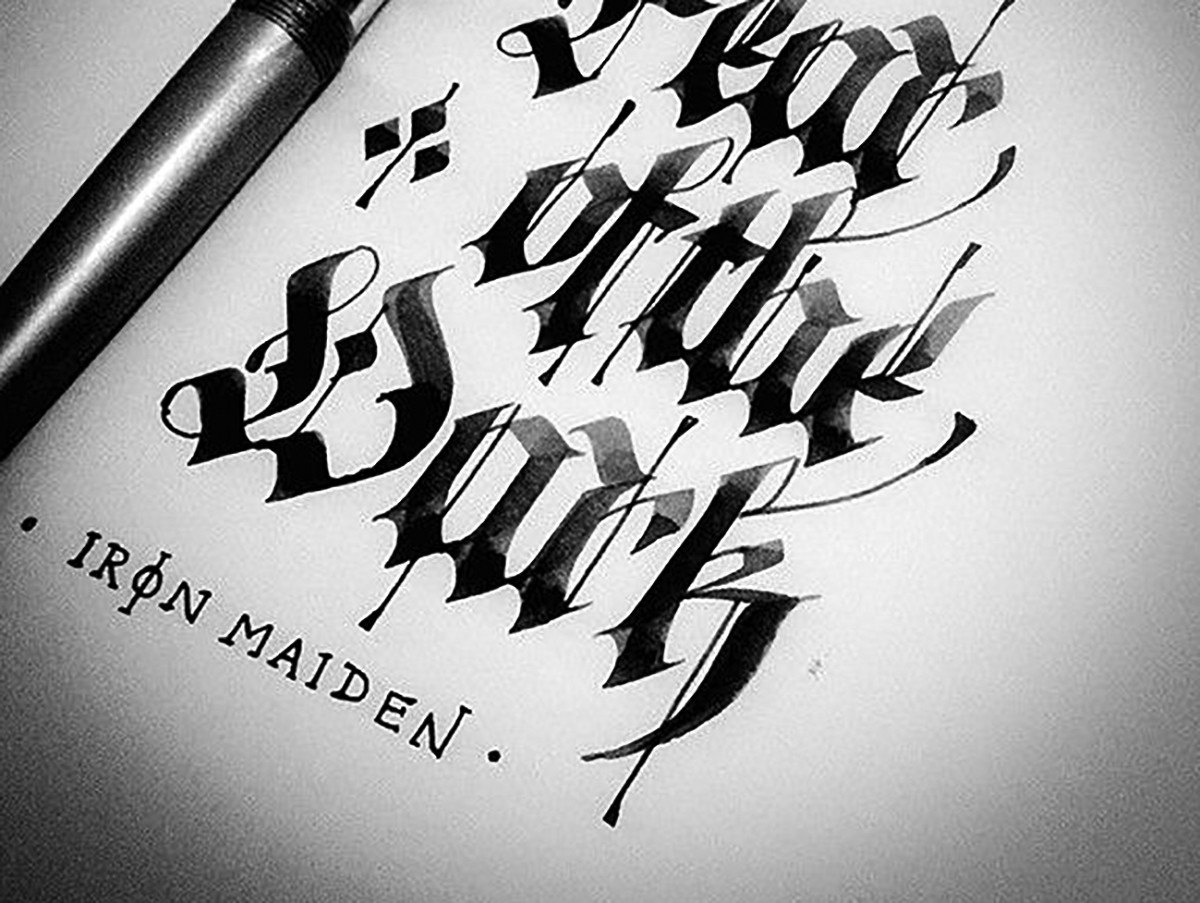
Gothic Textura written by Luca Barcellona.
Today the poor university writing of highly educated people has become a synonym for fantasy ferocity, medieval obscurity and superficial esotericism and can be seen in the merchandising of heavy metal groups and in tattoos of the suburbs, showing that the form and the history of writing are still unknown to mass culture.